Comments on independence

In statistics and probability theory, independence is a power condition for two random variables. For two random variables X and Y, they are independent if knowing X will not change the probability distribution of Y (and vice versa).

A related but distinct concept is correlation, which is a quantity between -1 and 1 that quantifies linear relationship between two random variables. Independence implies 0 correlation BUT not the other way around. Here’s an epic example for 0 correlation but no independence. Assume X might be -1, 0 ,or 1 with equal (1/3) probability. Let Y=X^2. Then it is easy to see that X and Y has 0 correlation but they are dependent to each other. One may interpret correlation as the linear dependence between two random variables. Thus, 0 correlation only shows that there is no the linear dependence but we might have higher order dependence. In the previous example, X and Y are in the quadratic relationship so that correlation–the linear dependence–cannot capture it.

Although independence is a stronger statement than correlation, they are equivalent if two random variables are jointly Gaussian. Namely, for two normal random variables, 0 correlation implies independence. This is an appealing feature for Gaussian and is one of the main reasons some researchers would like to make Gaussian assumption.

A more mathematical description for independence is as follows. Let F(x) and F(y) denotes the marginal (cumulative) distribution of random variables X, Y, respectively. And let F(x,y) denote the joint distribution. If X and Y are independent, then F(x,y) = F(x)F(y). Namely, the joint distribution is the product of marginals. If X and Y has densities p(x) and p(y), then independence is equivalent to say p(x,y) = p(x)p(y) (again, joint density equals to the product of marginals).

The independence is a power feature in probability and statistics. Some people even claim that independence is the key feature that makes “probability theory” a distinct field from measure theory. Indeed, independence makes it possible for the concentration of measure for a function of many random variables (concentration of measure: probability concentrates around a certain value; just think of law of large number).

Now let’s talk about something about statistics–test for independence. Given pairs of observations, say (X_1, Y_1), … ,(X_n, Y_n) that are random sample (IID). To goal is to test if the pair (X, Y) are independent to each other.

When two random variables are discrete, a well-known method is the “Pearson’s chi-squared test for independence”
(https://en.wikipedia.org/wiki/Pearson%27s_chi-squared_test#Test_of_independence). Pearson’s method is to compare the theoretical behavior of joint distribution under independence case (marginals are still based on sample) to the real observed joint distribution.

When two variables are continuous, things are more complicated. However, if we assume the joint distribution is Gaussian, we can simply test the correlation. If the correlation is non-zero, then due to the powerful feature of Gaussian–independence is equivalent to 0 correlation–we can claim they are dependent.

If we do not want to assume Gaussian, there are many nonparametric tests for independence. Here I list four famous approaches.

  1. Hoeffding’s Test. Hoeffding, Wassily. “A non-parametric test of independence.” The Annals of Mathematical Statistics (1948): 546-557
    (http://projecteuclid.org/euclid.aoms/1177730150). This test basically use empirical cumulative distribution (EDF) of F(x,y) versus products of marginal EDF and then take supreme over both x and y. This is like a KS-test for independence.
  2. Kernel Test. Rosenblatt, Murray. “A quadratic measure of deviation of two-dimensional density estimates and a test of independence.” The Annals of Statistics (1975): 1-14 (https://projecteuclid.org/euclid.aos/1176342996). Kernel test is very similar to Hoeffding’s test but we now use the kernel density estimator to estimate both joint density and marginals and then compare joint KDE to the product of marginal KDEs.
  3. Energy Test (distance covariance/correlation). An introduction is in [https://en.wikipedia.org/wiki/Distance_correlation]. Székely, Gábor J., Maria L. Rizzo, and Nail K. Bakirov. “Measuring and testing dependence by correlation of distances.” The Annals of Statistics 35, no. 6 (2007): 2769-2794 (http://projecteuclid.org/euclid.aos/1201012979). They derive a quantity called distance correlation and then show that the scaled version of this distance correlation converges to some finite value when two random variables are independent and diverges under dependence.
  4. RKHS Test (RKHS: Reproducing Kernel Hilbert Space). Gretton, Arthur, and László Györfi. “Consistent nonparametric tests of independence.” The Journal of Machine Learning Research 11 (2010): 1391-1423
    (http://www.jmlr.org/papers/volume11/gretton10a/gretton10a.pdf). This test uses the fact that independence implies that under all functional transformations for the two random variables, they are still uncorrelated (0 correlation). Then they use the reproducing property for the RKHS and kernel trick (note: this kernel is not the same as the kernel in kernel test) to construct a test for independence.

As a concluding remark, I would like to point out that there are some ways to “quantify” dependence. For instance, alpha-mixing, beta-mixing are some definitions for dependence among sequence of random variables that are commonly used in Time-Series. Wikipedia has a short introduction about these dependence measure [https://en.wikipedia.org/wiki/Mixing_(mathematics)].
Data Visualization and Statistics

Data visualization (and information visualization) is now a hot and important topic in both academics and industry.

Data visualization is concerned with how to visualize complicated data. One of the major goal for data visualization is to display important features in an intuitive and clear ways so that people without professional knowledge are able to understand. Without conducting a sophisticated analysis, some clear patterns can be directly observed after visualization. This is particularly useful for scientists to promote their work to general audience and potential collaborators.

Moreover, data visualization serves as a tool for exploratory data analysis. That is, we can visualize the data first and according to the structure we observe from the visualization, we choose how to analyze the data. When the dimension of the data (number of variables) is greater than 3, this technique is very useful.

Statistics and data visualization can have more interplay. With proper cooperation, statistics and data visualization can help solving problems from each other.

In data visualization, a problem is that we discard part of the information when we visualize the data. If the information we throw away is critical to our research, we will get into trouble. Thus, there is a need to study the information that each visualization approach discards and statisticians are perfect to do this job. Many visualization tools use some summary statistics and keep track of these features when visualizing; statistical analysis for these summaries allows us to understand what kind of information the summary provide and what type of information is ignored.

For statistics, a common problem for statistical analysis is that we cannot see the result we have analyzed. For instance, when estimating a multivariate function or a “set” in high dimensions, like a region of interest, we cannot see the result. A more concrete example is “clustering” at dimension greater than 3; it is hard to really see clusters in high dimensions. This problem is especially severe in nonparametric statistics; the “parameter of interest” is often infinite dimensional and it’s hard for statistician to “see” the estimator. However, tools from data visualization may provide helps for this problem. We can use the approaches from data visualization to display our result. Despite the fact that we may loss some information, we can have a rough idea how does our estimator look like and we can fine-tune our analysis accordingly.

The following two papers are examples for combining data visualization and statistics:

1. Gerber, Samuel, and Kristin Potter. “Data analysis with the morse-smale complex: The msr package for r.” Journal of Statistical Software (2011). URL: http://www.jstatsoft.org/v50/i02/paper

2. Chen, Yen-Chi, Christopher R. Genovese, and Larry Wasserman. “Enhanced mode clustering.” arXiv preprint arXiv:1406.1780 (2014). URL: http://arxiv.org/abs/1406.1780

Here are some useful links about data visualization (thanks to Yen-Chia Hsu@CMU – Robotic Institute):

http://senseable.mit.edu/
http://datavisualization.ch/
http://www.nanocubes.net/
http://www.informationisbeautifulawards.com/
http://labs.juiceanalytics.com/vizwelike/index.html
http://vis.cs.ucdavis.edu/Publications/
http://idl.cs.washington.edu/papers
http://vis.berkeley.edu/papers/
http://www.cs.ubc.ca/group/infovis/publications.shtml
http://vis.berkeley.edu/

Regressogram: a commonly used simple non-parametric method in science

Recently, I work a lot with scientists and notice that they are often using a simple method to visualize the data and make basic analysis.

This method is called “regressogram” in statistics. Simply put, Regressogram = Regression + Histogram. Here’s an example for regressogram:

regg05

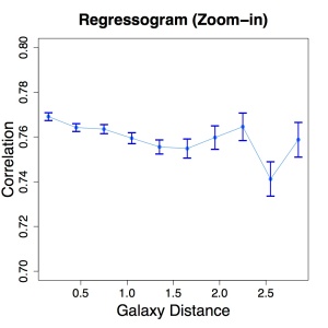
This is an analysis for astronomy data. On the X-axis is the galaxy distance to some cosmological structure and on the Y-axis is the correlation for some features of this galaxy. We binned the data according to galaxy distance and take the mean within each bin as a landmark (or summary) and show how this landmark changes along galaxy distance. This visualizes the trend of the data in an obvious way.

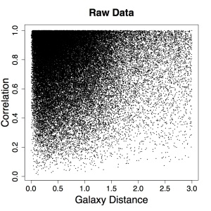
In fact, the original data is very ugly! Here’s the scatter plot for the original data:

regg01

Note that now the range of Y is (0,1) while in the regressogram, the range is (0.7, 0.8). If you want to visualize the data, I don’t think this scatter plot is very helpful. The regressogram, however, is a simple approach to visualize hidden structure within this complicated data.

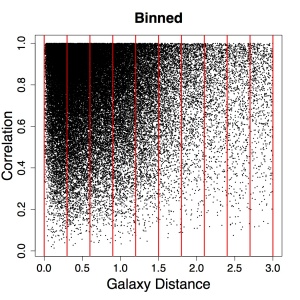
Here’s the steps for constructing regressogram. First we bin the data according to the X-axis (shown by red lines):

regg02

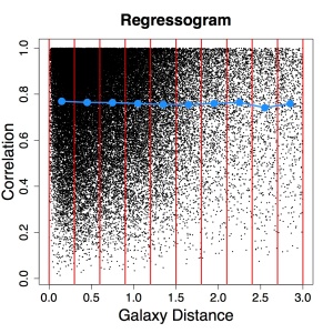
Then we compute the mean within each bin (shown by the blue points):

regg03

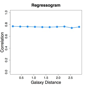
We can show only the blue points (and blue curves, which just connects each points) so that the result looks much more concise:

regg04

However, since the range for Y-axis is too large, this does not show the trend. So we zoom-in and compute the error for estimating the mean within each bin. This gives the first plot we have seen:

regg05

The advantage for regressogram is its simplicity. Since we’re summarizing the whole data by points representing the mean within each bin, the interpretation is very straight-forward. One can easily understand regressogram without any deep knowledge of statistics. Also, it shows the trend (and error bars) for the data so that we have rough idea what’s going on. Moreover, no matter how complicated the original plot is, the regressogram uses only a few of statistics (the mean within each bin) to summarize the whole data. Notice that we do not make any assumption on distribution (like normally distributed) of the data; thus, regressogram is a non-parametric method.

However, in statistics, regressogram is barely mentioned and very few people actually use it in research. The main reason is that the regressogram is a method for non-parametric regression and is not optimal. The predicted value of Y given X using regressogram is to find the bin where X lays in and use the sample mean within that bin as a predictor for Y. This prediction is suboptimal and there’re many alternative method such as local regression and kernel regression that has much better prediction accuracy. (The main problem for regressogram is the huge bias. We predict the same value within the same bin which makes it inflexible in prediction.)

Despite not being an optimal method for prediction, regressogram is still very attractive due to its simplicity. Especially for the case when we just want to grasp a rough trend of the data, some loss of accuracy to trade simplicity is always preferred. Hence, regressogram is still very popular in science.

I end this article with an interesting observation. Although regressogram is widely used in scientific research, very few scientists know the name of this method. Maybe regressogram is too intuitive for most scientists so that they do not care about its name.

Statistics and Science

Many people asked me “Is statistics a science?”

To me, statistics belongs to the “formal science”, which is a discipline of science.

Simply put, the science is the knowledge built by a strict process, called the scientific approach and this knowledge is open to test. Usually, the science we refer to is the physical science or life science which concerns with the knowledge to physical objects or living creatures.

The formal science is the knowledge about the “sign systems” (formal system) like logic and mathematics. In the formal systems, everything is well-defined so that the inference can be made exact; there is no exception. We begin with a structure with some well-defined operations and we derive the implication/result to this structure based on the operation defined. For example, the number system is a formal system and an inference like 1+1 is exactly 2 with no exception.

The conclusion of our derivation gives us the knowledge to this formal system. In the system of probability, the law of large number tells us that the sample mean of independent, identical random variables will converges to the true population mean. Without this knowledge, we have no idea what will happen to the sample mean as we have infinite number of observations. The law of large number (in fact, it is a theorem) is a knowledge to the formal system derived by the axioms of probability theory.

The formal science plays a key role in other disciplines of science by providing well-defined models to describe the world. For instance, Einstein’s mass-energy equivalence states “E=mc^2” which gives a model that links three distinct physical quantities, the energy E, the mass m and the speed of light c. If we do not define the notation of multiplication or equality (imagine the life in thousands of years ago), we can never acquire this knowledge about mass and energy.

As a member of formal science, statistical theory provides many help in scientific research. Take the t-distribution as an example, without the knowledge of t-distribution, the commonly used t-test has no guarantee on its effectiveness. Thus, scientific studies that make conclusion by the t-test will be questioned about their discovery.

Thus, statistics is of course part of the science. But the system we contribute knowledge to is not the usual physical system but a formal system.

The mode clustering

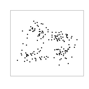
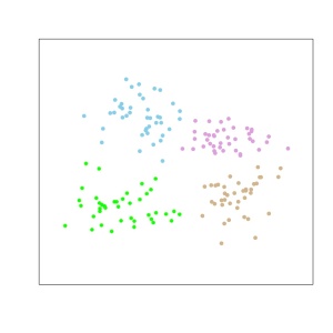
In multivariate analysis (also called unsupervised learning), a common statistical problem is to cluster data pints. For instance, given a data as follows:

EX3-4


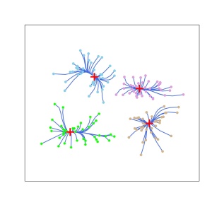
The goal is to cluster the data into several partitions. For instance, like this:

EX3-7


There are many different methods for clustering. Common approaches include the k-mean clustering, spectral clustering, linkage methods…e.t.c.

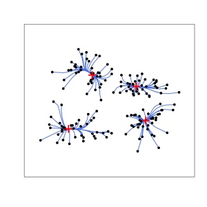
Here, I want to introduce the mode clustering method which is a simple but not commonly used technique in statistics. The mode clustering is to cluster the data based on the modes (local maximums) of the density function. The idea is simple: given a density function, for each point, we follow the gradient path for the density until we arrive a mode. Back to our example, the mode clustering looks like this:

EX3-5


Each blue path is the gradient path from each data point. We have four clusters corresponding to the four modes and every point is assigned to one cluster/mode.

The algorithm for mode clustering is called the “mean-shift” algorithm. This is a well-known method in computer vision and image segmentation. In fact, the mean shift algorithm is pushing data points according to the gradient path of a kernel density estimator to the density function.

To sum up, the mode clustering is

  1. find the estimated density function,
  2. evaluate the gradient of the estimated density,
  3. shift data points according to the gradient.

Since the density estimator is the kernel density estimator, the statistical properties are well-studied. Thus, we can study the properties for the mode clustering by using theories for the kernel density estimator.

Interestingly, the mode clustering is not well-known to the statistical society. But I believe that in the future, this method should attract more attentions from statisticians since compared with other methods, the mode clustering has a well-established theory.

EX3-6


Reference: Enhanced Mode Clustering. (2014) Yen-Chi Chen, Christopher R. Genovese, Larry Wasserman. http://arxiv.org/abs/1406.1780

Thoughts on Statistics and Data

Recent days I was talking to some friends on the philosophy of analyzing data. I conclude that statistics is not the only way to study data but definitely a very useful way. In my opinion, statistics is the analysis of data using probability model. Such a probabilistic formalism has several merits. In this post, I briefly introduce two nice properties for the statistical model.

First, statistical model for data is always in a simple form. In most cases, the data is full of noises and it is often hard to explain the formation of the noises without using the probability. In statistics, we simply model the generating process by using the notion of probability so that we can easily explain the randomness or the uncertainty of the data. For instance, in regression, our data is pairs of (X,Y) and we want to find the relation between Y and X. Generally, it is hard to find a simple function such that Y=f(X) for all points. However, in statistical model, we use Y = f(X)+noise. This is so-called the signal+noise form.  In this model, the function f(x) (also called the regression function) can be modeled as a simple function as the noise is very reasonably distributed (reasonably: in terms of probability). The well-known simple linear regression is to use f(X)=a+bX which is very simple and easy to interpret. 

The second advantage is that the statistical model provides a population level analysis. The population level analysis means that we can perform lots of analysis given the true population. For instance, we know that given a specific sample size, the sample mean will differ from the population mean due to the randomness of sampling process. However, if we have full information on the true population (usually we assume what the population looks like), we know the strength of randomness in the sample mean. We can compare this to what we observe in the data. Hence, we can check the reasonableness of our assumptions. This leads to the hypothesis test and model checking (model diagnostic) in statistics and is also widely used in scientific studies.

Statistics also has other nice features such as the asymptotic analysis and uncertainty quantification. I will introduce these characteristics later.

Random thoughts: Statistics vs Statistical engineering

Recent days I attended many talks given by people from statistics and statistical engineering (machine learning, data mining…etc).

I notice that people doing theories in statistical engineering is quiet similar to people in statistics. We do lots of statistical analysis on the method/algorithm and build some useful bounds for the convergence rate.

However, I just found that there’s a feature for people in statistics that people in theoretical engineering usually do not have: seeking for the asymptotic distributions. It is true that many people in statistical engineering try to find the bounds on convergence rate. The bounds are like their destination; they usually not go further for the distribution. In contrast, people in statistics will not stop at the rate; statisticians are targeting at the asymptotic distributions.

The reason why statisticians care about asymptotic distribution may be related to the statistical inference. The statistical inference such as confidence intervals, hypothesis tests, requires knowledge about the distribution of a certain statistics. Knowing the bounds is not sufficient for carrying out the inference. Both confidence intervals (or more general, confidence sets) and hypothesis test require the distributions.

This might also be the reason why courses in ML emphasizes more on the Hoeffding’s inequality, Bernstein’s inequality while in statistics, the courses focus more on the central limit theory and chi-square approximation.

Usually, finding the bounds on convergence rate is much easier than finding the true distribution. This might be a reason why many popular methods in statistical engineering are not so welcomed in statistics. The lack of asymptotic distribution reduces popularity from statisticians. However, many methods though have no asymptotic distribution, are still very useful in prediction, especially those with guarantees from probability bounds. Maybe we statisticians should not limit ourselves to those methods that are capable of statistical inference.

Anyway, I just discovered the feature for statisticians on deriving the asymptotic distributions. Maybe this is just my bias sample or maybe it is the truth. I’ll keep using this feature as a predictor to the future talks.

The likelihood function is not a probability function

Some people always misinterpret the likelihood function as probability function. They’re similar and related but distinct.

The likelihood function is a measure of an intensity of likelihood for a particular value for the parameter that varies as the “parameter” (here we consider a single parameter) changes. This measure cannot be interpret as probability. The main reason is that we do not assume any probabilistic structure for the parameters (note*). Parameters are fixed but unknown quantities.

For instance, the mass of sun is a parameter that influence the sunlight intensity. Based on data, we can infer the mass of sun by the likelihood function. So we can say the case that the sun has mass 1.9891 × 1030 kilograms has the likelihood 0.9 (numbers are made by arbitrary). This does not mean that the mass of sun is a random quantity (and it shouldn’t); it just states that the intensity of sun’s mass being 1.9891 × 1030 kilograms by the likelihood measure is 0.9.

For another example in the daily life, assuming you want to know somebody’s age. However, you cannot directly ask him/her (this may be impolite). All you can do is to infer the age by asking him/her some other questions. Based on the responses, you can make some inference. So after a short chat, you will make a conclusion in your mind like “there’s 0.3 likelihood that his/her age is 25”. However, this doesn’t mean that his/her age has probability 30% being 25; the age is just an unknown value for you and has no probability.

It is true that the likelihood function is related to the probability density function (note**). For probability density function, we fixed the parameters and consider the probability density for different observations. For likelihood function, we use the same form of probability density function but we fixed the observation and consider different parameters. A critical difference is that if we sum over all possible observations for the probability density function for any fixed parameters, we will get 1. But the sum over all possible parameters under a specific observation is usually not 1 and even infinity. This makes the likelihood function differs from the probability density function.

Note*: This is called the Frequentist’s point of view. In the view of frequentist, the parameters are just unknown quantities that have no probability structure. In statistics, there’re another school called the Bayesian. In Bayesian’s perspective, the parameters can have probabilistic structure. 

Note**: The probability density functions is in fact the joint probability density function for continuous random variables and is the joint probability mass function for discrete random variables.

A non measure-theoretic explanation on almost sure convergence

In probability theory, there’re three comment convergence concepts: convergence in distribution, convergence in probability and convergence almost surely. Among them, the convergence almost surely is most abstract and many people find it hard to understand (especially people doing statistical engineering). To formally define convergence almost surely, we need to use a measure-theoretic argument. Here I try to use a concept from computer to illustrate almost sure convergence and avoid using any measure theory.

The almost sure convergence is defined on the abstract “sample” space. One can understand the sample space as the collection of “seeds” used to generate the random number for a computer. In the past, how computer generates a random number is by inputting a “seed” and according to this seed to output a series of values. If we input the same seed, the output value will be the same.

A random variable can be interpreted as a function (or a program) that input a “seed” and output a value. The function is fixed; that is, given the same seed, this function will output the same value.

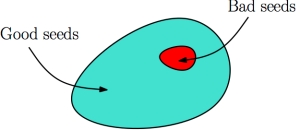
Having identified random variables as functions, a sequence of random variables is a sequence of functions. For a sequence of functions, given the same seed, we will have a sequence of values. If these values converge to a specific value, then we call this seed a “good seed”. Otherwise we call the seed “bad seed”.

An example for the collection of good seeds versus bad seeds

An example for the collection of good seeds versus bad seeds

Now we test all seeds to see if they are good seeds or bad seeds. After examining every seed, we get a collection of good seeds and another collection of bad seeds. The function convergence “almost surely” if the ratio of the number of bad seeds to the number of good seeds is 0; in other words, the good seeds dominates the majority. Note that if number of good seeds is infinity, we allow number of bad seeds to be finite and non-zero and we still have convergence almost surely.

As a result, almost sure convergence is defined through “the limiting behavior of the sequence under a fixed input”. And the sequence converge almost surely is like the ordinary convergence of functions excepts for “negligible ” small portion of points (i.e. input, seeds).

For convergence in probability, we can still use our good seeds bad seeds principal but the definition is slightly different. We need to set a tolerance level. Now “for each function” in the sequence, we examine the output value for a given seed and compare it with the output value for the next function in the sequence with the same input seed. If the difference is below the tolerance, we call this seed a good seed otherwise it is a bad seed. For each function in the sequence, we will get a collection of good seeds and a collection of bad seeds. So we will have a sequence of pair of collections for good seeds and bad seeds. Note that the two collections of good/bad seeds are unique for each function in the sequence.

Here we consider the ratio again. Since we have pairs of good seeds collection and bad seeds collection, we can calculate the ratio of bad seeds to good seeds. Accordingly, we obtain a sequence of ratios derived from the sequence of pairs of collections for good/bad seeds. We call the sequence of function convergence in probability if the sequence of ratios converge to 0.

A crucial difference between convergence almost surely and convergence in probability is that for almost sure convergence, we only have one pair of good/bad seeds collections; on the contrary, for convergence in probability, we have multiple pairs of good/bad seeds collections. For convergence in probability, we allow the collections of good/bad seeds to be non-stationary (that is, the collections are keeping changing) but just keep ratio going to 0. This cannot happen in the almost sure convergence since for almost sure case, we have only one pair of good/bad seeds.

For convergence in probability, we allow the bad seeds keep changing. This is not allowed in convergence almost surely.

For convergence in probability, we allow the collection of bad seeds keep changing. This cannot happen for almost sure convergence since in almost sure convergence, good/bad seeds is determined only once.

Note: For those who have learned measure theory, I define the sample spaces to be the collection of all seeds and use the counting measure. I also use the concept of Cauchy sequence to define convergence concept in convergence in probability.

Statistical Engineering

In my opinion, machine learning, data mining , pattern recognitions ..etc are branches of ‘statistical engineering’. I find the relationship between these disciplines and statistics is very similar to engineering versus science.

In engineering, people focus on the prediction, real performance and optimization for a process/procedure/algorithm. Theoretical analysis for engineers are not the as important as the empirical performance of a method. And how to use a method in solving practical problems is more important than to understand how it works. This is the case in machine learning, data mining and pattern recognition.

For instance, if a new method is proposed, it will be very popular in machine learning or data mining once the empirical performance is very good. How people classify a method as a good one is through the performance on a variety of data. In addition, those who are doing machine learning or data mining prefer to learn how to implement a method rather than to understand why this method works.

On the contrary, the scientific research emphasizes on constructing a general rule/model to explain the phenomena. Understanding a phenomenon is usually more important than knowing how to apply the outcome to real problem. For instance, astronomers develop lots of theories to explain the orbit, motion of a planet. However, astronomers do not care much about how this knowledge can be practically used in daily life.

In data analysis, the phenomena to be explained are the results from a statistical method such as the error of an estimation. For example, if a new method is proposed, it will arise statisticians’ attention once its theoretical performance is good. When there’s no theoretical guarantee for this method, statisticians will try to construct theories to explain how this method works. Besides, statisticians usually prefer understanding how a method works to learning how to implement it.

One can see that statistics versus machine learning/data mining/pattern recognition is nearly the same as science versus engineering. That’s why I use the term “statistical engineering” for these disciplines.